On Black Power from Jon Duong on Vimeo.

Me llamo Jon Duong. This is a blog for design school.
Wednesday, May 11, 2011
Monday, May 9, 2011
Journal 14: Semester Reflection
Over the course of this semester I would definitely say I experienced a good deal of growth as a designer. While it may have been fast-paced, grueling, and painful at times, I feel like a stronger person as a result. I have learned so much in terms of design principles and approach to creativity. For all that has happened, I am truly grateful for having run the course, because I now understand the necessary steps to take when I move on with this major. If I had to pick one thing that inspired me the most this semester, it would definitely have to be the typographic workbook, because while I was designing based on a realistic scenario, I simultaneously learned so much about typography as a result. Though there was a large amount of restrictions and specifications with the content, I was still able to find a way for my creative personality to reflect in the book. All in all though, everything I learned this semester was of great relevance and I will for certain take it into my design future.
Sunday, May 8, 2011
Journal 12 & 13
Journal 12:
Paula Scher:
- Scher's interview was a basic summation of the idea of type as an image before it is language. She spoke of the older processes like rubbing down press type and using acetate to paint over letterforms. What really spoke to me though were her theater poster designs that she said had in previous years been dominated by European style. In these designs she incorporated urban influence that popped, was loud, and gave life to the posters. I thought it was interesting to hear her speak of designing based on non-sight senses like hearing or touch. Scher seems to design on a level that touches base on so many feelings that really breathes life into type in a way that computer-based designers do not seem to understand. If I could ask her anything, it would probably concern the transition to computers for typesetting rather than manual. How has the change effected design method overall? Are we better or worse as designers for this change?
David Carson:
- Carson immediately addresses his lack of formal training in this interview. He spoke of designing based on visual appeal, rather than basic typographic principles. Despite that, his work is still appealing and compelling. What I found interesting about Carson is his view on subjectivity in design. Carson feels that a design should be extremely subjective and should have some of the designer's personality reflected in it. He feels that a design should be made with your own feeling over concern with awards or boundaries. I agreed with this to a degree, but I do have to ask though, shouldn't there be a unity between personality and principle? So if I got the chance to ask Carson anything, it would be about his training as a designer? Does he ever wonder how his career would have been affected had he been formally educated in the field?
James Victore:
- Victore's interview began with a montage of some of the edgiest, gloomiest, and strongest illustrations I have seen. In the video Victore spoke and emphasized the primary function of a graphic designer is to create works that call to and address various societal issues, rather than for marketing and advertising purposes. What struck a chord for me is how Victore spoke of designing to respond to issues that lack attention in the world. It was interesting how he executed his goals in his works, because they were so immediate and able to draw my attention. I liked how his designs reflect the overall fast-pace and impatience of many people, because they were quick, to-the-point, and memorable. If I could ask him anything, I would ask how long on average he spends on developing the concepts of his works, because they're simply genius. Simple and genius.
Journal 13:
Larry Lessig is is one of our foremost authorities on copyright issues, with a vision for reconciling creative freedom with marketplace competition. In his talk he spoke of issues of copyright and trespassing being hampers to creativity in general. He provided examples through a brief history of copyrights and the application of existing material for new material, like remixes. What I found interesting about this talk is Lessig's theories on the unity of business and creativity. He spoke on the growth of technology and how it enables our generation to create through innumerable methods. Because of this, Lessig states that our generation is learning to speak primarily through these methods. He feels that businesses should let the artists and creators themselves decide what can and cannot be made available. Because it is business that is hampering the way that people communicate through the new and ever growing language of technology. Lessig's views on creativity were interesting to hear, and the thought never occurred to me as a designer that commerce could be such an obstacle. But thinking to all the printing and media limitations I've dealt with, I would have to agree with Lessig. I should not have to create based on limitation, I should be able to create without bounds.
Monday, May 2, 2011
Sunday, April 24, 2011
Journal 11: Design Matters
Debbie Millman is the president of the design division at Sterling Brands, a leading brand consultancy based in New York. She is known for also being the host of Design Matters, a radio-show on DesignObserver.com. Design Matters is a radio-show that takes listeners into the world of prominent design professionals and discusses their processes and philosophies on designing.
I chose to listen to the interview with Ann Willoughby, the president and creative director of Willoughby Design Group, a brand, innovation and identity design firm she founded in 1978. Aside from the fact that Willoughby is based out of Kansas City, I found some other interesting things in the interview concerning her and design. Miller first started off with discussed an icon project concerning the nature of pain. She designed some icons for a chart for patients in a hospital to associate levels of pain with an icon. Miller then explained how pain has then become subjective because of the brain's ability to articulate pain through other visual means. When it came to Willoughby, what I thought was compelling was her perspective on design's current environment. Her opinion was that it is harder now to balance outside life with design now with more distractions of technology. Willoughby went on to discuss how today relationships of designers and clients has certainly changed from being in less touch personally with the concern with technological innovations increasing the rate of communication to beyond a capacity that would build relationships. She also brought up issues of time management and isolation, and how they can be more of a problem now with the technological distractions that she discussed earlier. I definitely connected with the interview in terms of relation with designer issues, and what Willoughby says to combat these things reassures me in a way that I hope to incorporate into my daily process.
I chose to listen to the interview with Ann Willoughby, the president and creative director of Willoughby Design Group, a brand, innovation and identity design firm she founded in 1978. Aside from the fact that Willoughby is based out of Kansas City, I found some other interesting things in the interview concerning her and design. Miller first started off with discussed an icon project concerning the nature of pain. She designed some icons for a chart for patients in a hospital to associate levels of pain with an icon. Miller then explained how pain has then become subjective because of the brain's ability to articulate pain through other visual means. When it came to Willoughby, what I thought was compelling was her perspective on design's current environment. Her opinion was that it is harder now to balance outside life with design now with more distractions of technology. Willoughby went on to discuss how today relationships of designers and clients has certainly changed from being in less touch personally with the concern with technological innovations increasing the rate of communication to beyond a capacity that would build relationships. She also brought up issues of time management and isolation, and how they can be more of a problem now with the technological distractions that she discussed earlier. I definitely connected with the interview in terms of relation with designer issues, and what Willoughby says to combat these things reassures me in a way that I hope to incorporate into my daily process.
Speech Project: Answer the Question
How do you think the audience experience will change based on the media? What will the audience exprience in print. In Motion. What can you do in print that you can't do in motion. What can you do in motion (in aftereffects) that you can't do in print?
- I think with the innovations in interactive designs that the audience experience will certainly become more intimate. What seems to interest people in design is the act of interacting with the product/design, and I think that with that fascination that the audience experience will become a more important part of design than ever before. In print, I think that any sort of mood conveyed will not change for the audience, but the level of dynamism will certainly increase to flow naturally with pieces within different media, say web or motion. For motion, the visualization of language will carry a stronger presence, as it is a quick, interesting way to put forth what one is trying to say in a given subject. For print, things you can do that can't be done in motion are things like manipulating level of control. For the viewer/reader, print enables them to control how long they delve into any aspect of the design. In motion, a large part of what makes it distinct from print is the designers ability to control experience without ambiguity. This can engage the audience in a great way, as options open up with sound and pacing. What is great about both options though is the sheer fact that the audience is compelled to interact with the design no matter the form.
- I think with the innovations in interactive designs that the audience experience will certainly become more intimate. What seems to interest people in design is the act of interacting with the product/design, and I think that with that fascination that the audience experience will become a more important part of design than ever before. In print, I think that any sort of mood conveyed will not change for the audience, but the level of dynamism will certainly increase to flow naturally with pieces within different media, say web or motion. For motion, the visualization of language will carry a stronger presence, as it is a quick, interesting way to put forth what one is trying to say in a given subject. For print, things you can do that can't be done in motion are things like manipulating level of control. For the viewer/reader, print enables them to control how long they delve into any aspect of the design. In motion, a large part of what makes it distinct from print is the designers ability to control experience without ambiguity. This can engage the audience in a great way, as options open up with sound and pacing. What is great about both options though is the sheer fact that the audience is compelled to interact with the design no matter the form.
Sunday, April 17, 2011
Journal 9 & 10: Trollback and Good.is
Journal 9:
Jason Trollback brought up some interesting ideas concerning design and motion graphics. In his talk, he discussed things like designing for a purpose, using motion to let a story flow in a natural, seamless way, and designing for purpose rather than pure visuals. I thought it was cool to hear how he explained designing with expression, and how one can design with a certain message to create impact. I do agree that designs have more relevance when trying to convey or promote a very particular cause, movement, or action with a lot of emotion. I also liked how Trollback spoke about inspiration. I tend to forget that inspiration can be found outside the world of art and design, it is just a matter of exploring. The strength of visual communication relies on many things, from the self-determination of the designer to the concept in itself, which should be well-explained and developed before actual designing begins. Trollback did well to reinforce some older points that I've read while bringing some new ones to my attention.
Journal 10:
Good.is:
What I found most interesting about GOOD is its ability to condense information to its simplest form while still retaining valuable information. The infographics carry a great deal of information, but through use of strong, simple icons and repeated imagery, a reader/viewer is still able to soak in the basic idea conveyed. For example, two infographics I looked at were one that depicted worldwide oil usage through size contrast of oil barrel icons, and an infographic depicting heart disease myths using symbols as the dominant imagery. I thought both were well-designed and they let the information flow in an extremely successful manner. I also watched two motion graphics videos, one depicting the cost of war and another reviewing the year of 2008. I found with both that the narration, type, and imagery were well connected and the pacing just right. It was cool to see how well the dialogue synced accordingly with quirky illustrations and well organized type. The transitions were unique, and each subject within the videos had a natural change without becoming disconnected.
As far as the style goes, I love GOOD's aesthetic. The illustrations are well drawn but still grounded in a way that doesn't leave me overpowered when I'm trying to look at all the little factoids. The color usage tends to be limited, but this only strengthens the overall design. The type isn't necessarily dynamic, but the standard usage of two or three typefaces just made me understand that GOOD only does so to let one know that whatever you're looking at is clearly something GOOD did.
Simplicity and concision seem to be a large part of GOOD's representation. You can learn a lot through very little.
Tuesday, April 12, 2011
Type in Motion
On Black Power:
Who is speaking?
- Malcolm X
Why was/is the speech important to society?
- Was addressing the civil disobedience of followers of Martin Luther King
Why do you feel this is important or interesting?
- I find it interesting how he calls for action and unity within the black community before trying to make efforts to unite with the rest of the nation. He is trying to reinforce a strong foundation within his race.
What is the emotion, mood, tone, personality, feeling of the speech?
- It seems a little less formal with frequent "um's" and "uh's" and therefore more inviting to a listener, as if it were in conversation rather than speaking to a large group. It is intimate.
What is intonation, emphasis, what is loud, stressed, or soft. Where are there pauses...
- Emphasis is placed on the racial identifiers. Words like "black" and "white" are raised slightly in volume. Problems like "drug addiction" are stressed.
What do you FEEL should be loud or soft, long pause or rushed?
- I would have to say the problems addressed by Malcolm should be louder if anything, and the rush of locations at the end of the speech should be as well.
Is there a call to action? When listening to it what are key/emphasized words?
- Before trying to unite with the whites of America, Malcolm stresses that blacks need to first become accepting of each other and unite together, rather than on their own movements. Some stressed words include "blacks" "whites" "potential" "vices" "community"
How does it make you feel? How do imagine that the audience felt?
- It made me feel that every point he made was correct. I felt motivated, and I can imagine the audience felt the same way when it came to taking action.
Could there be another interpretation of the speech?
- I doubt it, it wasn't really cryptic by any means. Pretty much a straightforward speech during the civil rights movement.
Write/find a short bio, of the person giving the speech.
- Malcolm X (born Malcolm Little) was an African-American Muslim minister, public speaker, and human rights activist. To his admirers, he was a courageous advocate for the rights of African Americans, a man who indicted white America in the harshest terms for its crimes against black Americans. His detractors accused him of preaching racism, black supremacy, antisemitism, and violence. The beliefs expressed by Malcolm X changed during his lifetime. As a spokesman for the Nation of Islam, he taught black supremacy and deified the leaders of the organization. He also advocated the separation of black and white Americans, which put him at odds with the civil rights movement, which was working towards integration. After he left the Nation of Islam in 1964, Malcolm X became a Sunni Muslim, made the pilgrimage to Mecca and disavowed racism, while remaining a champion of black self-determination, self defense, and human rights.
On February 21, 1965, in Manhattan's Audubon Ballroom, Malcolm X began to speak to a meeting of the Organization of Afro-American Unity when a disturbance broke out in the crowd. As Malcolm X and his bodyguards moved to quiet the disturbance, a man rushed forward and shot him in the chest. Two other men charged the stage and fired handguns, hitting him 16 times. Furious onlookers caught and beat one of the assassins as the others fled the ballroom. Malcolm X was pronounced dead at 3:30 p.m., shortly after he arrived at Columbia Presbyterian Hospital.
Malcolm X has been described as one of the greatest and most influential African Americans in history. He is credited with raising the self-esteem of black Americans and reconnecting them with their African heritage. He is largely responsible for the spread of Islam in the black community in the United States.Many African Americans, especially those who lived in cities in the Northern and Western United States, felt that Malcolm X articulated their complaints concerning inequality better than the mainstream civil rights movement did.
Sunday, April 3, 2011
Journal 8
Type Means Never Having To Say You're Sorry:
I think a few alternatives to Futura would have to be Gotham, Helvetica, and Trade Gothic. The character widths of Helvetica and Trade Gothic are similar to Futura and Gotham retains the same cohesiveness of most geometric san-serifs. While I do believe that Futura is a great typeface in terms of versatility of applications, I should always remember that lots of other typefaces can serve the same purpose as Futura. Even though which tends to be a safe choice, it may not be the best for a design.
Designing Under the Influence:
Michael Beirut's article initially discusses the iconic usage of Futura in Barbara Kruger's work and how she created a definitive style through her usage of the typeface. It then goes on to question if a graphic design style can actually be owned by any one person amidst designing from influences, as homages, or even approprations. The article also asks the amount of design history one must know before even conceptualizing. As for me, I think this article brought up a valid point on the terms of plagiarism in the design world. Being a student, I have to draw inspiration from somewhere, but to the degree it is reflected in my designs needs to be evaluated all the time. For me there's quite an amount of apprehension to making design risks when all I see risk-wise seems to have been done in the many years that have past. So to question originality, I should really evaluate my designs constantly, always wondering what I can do to make something that follows good conventions but hone in on what makes it my own.
Sunday, March 27, 2011


Monday, March 14, 2011
Journal 6: Thirty Conversations on Design
For me the most inspirational design is probably album covers. Good album covers are able to sustain time with moving artwork. They also speak to the personality of the musicians in a way that defines the aesthetic of their musical culture in a way that has largely shaped personalities of listeners.
The problem design would need to solve is idea development. For some it takes a large volume of exploration to get the right idea, and for others good ideas come almost immediately. If there were someway ideas could be generated more efficiently that didn't entirely exhaust creativity, that would be swell.
K. Kirk & N. Strandberg:
Kirk and Strandberg find the iPhone to be the most influential design. Its interface is convenient and practical, allowing for mobile possibilities in business and leisure. Its changed business and social practices. For them, design needs to improve compatibility and universal accessibility in smart-phones. With the growth of social networking, connection is at high demand, and communities need to develop ways of allowing the rapidly growing ways of staying connected with individuals. I would agree with Kirk and Strandbergs points. The iPhone has most certainly changed communication for the better, because it gives us what we want faster. As a society, are patience is lessening, and the iPhone improves this to a degree. I feel that people would most certainly benefit if communities were able to increase electronic accessibility.
Jake McCabe:
McCabe finds paper to be the most influential design. Its creation is strenuous in coming up with the correct colors and textures, but the blankness leaves for much opportunity creatively. For McCabe, design needs to solve sustainability. Designers need to ask the questions no one has asked, for the solutions to those questions can make revolutionary design. I thought McCabe's view on paper was interesting, because I never view paper as an opportunity, but rather as a means of starting something. For sustainability, I felt he made a good point, because solutions to new problems are fresh and eye-catching.
Jessica Helfand:
For Jessica Helfand, students are the most influential part of design. This is because Helfand feels because students thought processes and imagination are ever-changing and growing, that she herself is learning from them. For Helfand, the problem design needs to solve next is problem solving itself. She feels that solutions need to be solved with the long-term in mind, rather than the immediate. I would agree with both of Helfand's points, for I have yet to stick with any one design mindset or philosophy, and though I currently think with immediacy in design, I should probably start to broaden the thought process when it comes to solutions.
Kit Hinrichs:
Hinrichs finds that the most influential design is typography. For him typography expresses emotional value through its letterforms and its versatility allows for usage on infinite applications. What Hinrichs feels needs redesigning are airports. He states that much of the technology within seems to be outdated, as well as the methods of security checks. As far as the relevance of typography goes, I would obviously agree with Hinrichs. There is so much personality in the typefaces I've come to know and appreciate, and I think that it is one the most important aspects of visual communication as a whole. As for the airport redesign, I wouldn't necessarily say it needs revamping just yet. Airports seem to do a good job with crowd control and security measures anyway, so don't fix it if it isn't broken.
Tony Hawk:
A professional skateboarder and owner of several skateboard companies and foundations. Tony Hawk finds the most inspirational design for him comes from Apple products. By developing visually appealing electronics and simplified operating systems, Apple has strived to create products that are more accessible to the general public. I myself agree with Hawk's praise for Apple products because as an owner of a Macbook and iPod, I found that initial use was easily done and the overall look Apple has created really speaks to me. Apple has created a near-minimalist aesthetic that reflects a sense of cleanliness, concision, and simplistic beauty.
Tuesday, March 1, 2011
Journal 5: AIGA Gain Conference, Jonathan Harris
Summary:
- Jonathan Harris is a computer programmer and web developer whose goals center on bringing humanity back into the digital age. Initially, Harris was an extremely hands-on person when it came to art and design, filling sketchbooks with elaborate thoughts, paintings, photos, objects, and more. But after losing 8 months of work in a mugging, he heavily reconsidered how he should develop his ideas, so he turned to computers and the web as a means of creating. Subsequently, in his numerous projects and extensive coding and isolation, he became increasingly separated and depressed. Harris's lecture was a summation and address of how technology is shaping how humans socialize and interact, and while technology may make things efficient, humanity is changing in way Harris fears isn't beneficial. So he resolved to create digital applications for the rapidly growing digital society that reinforce human interaction while keeping up with the times.
Reflection:
- Harris brought up many issues I myself am having this semester in terms of design. I understand that it is necessary to step away from my computer once in a while, but I often feel I work so slow and meticulously that often I fear that I don't have time to step away from my homework. Sure I'm sleep deprived, often giving up social time for homework, plus a lot of computer work involved, but that's the major. I understood and agreed full-heartedly in Harris points, and from this I will attempt to balance humanity and graphic design.
Monday, February 28, 2011
All About the Grid, and other Typographic questions
What are the advantages of a multiple column grid?
- A multiple column grid forces order onto a layout and acts as an orientating device for placing information by importance. It allows for complex information to be well-guided and seamless for linear reading and understanding. It also allows for good experimentation.
How many characters is optimal for a line length? words per line?
- 40-50 characters is the optimal amount for a line length. There should be anywhere from 6-8 words per line.
Why is the baseline grid used in design?
- It allows the bottom of every line of text to be set in uniform increments, allowing all lines to line up across the columns and creating good visual rhythm. Helps the structure.
What is a typographic river?
- Gaps that appearing to run down a paragraph of text, due to a coincidental alignment of spaces. They can occur regardless of the spacing settings, but are most noticeable with wide inter-word spaces caused by full text justification or monospaced fonts.
From the readings what does clothesline or flow line mean?
- An imaginary line that aligns horizontally to text to allow for good readability and flow.
How can you incorporate white space into your designs?
- White or negative space can be incorporated into designs by grouping or breaking up text into sections. Also leaving margins blank and maintaining asymmetry in white space makes for an interesting composition. Adjusting justification/ragging, type size, and column size also helps.
What is type color/texture mean?
- Typographic color is determined by the typeface, weight, spacing, leading, line length and more. It can be used to create depth, contrast, and varying densities and values throughout the design.
What is x-height, how does it effect type color?
- X-height is the height from the baseline to usually the top of a lowercase letter in a typeface. It affects typographic color because it can give the copy varying values of color through its size differentiation.
In justification or H&J terms what do the numbers: minimum, optimum, maximum mean?
- Minimum refers to the least amount of words before and after a hyphen. Maximum refers to the space being manipulated so the right and left margins are straight. Optimum refers to fitting the most amount of words in a given space with consideration to page style.
What are some ways to indicate a new paragraph. Are there any rules?
- There are many ways. It can be done through use of rules, color fields, dropcaps, different font-styles like bold or italic, weight, leading, size, indentation, highlights, spacing, and more. The only rule I know of is to not indent the first paragraph. Other rules include: size of indent (use equal to leading or slightly larger, but always less than 1/2"), if indenting do not add a space between paragraphs,
What are some things to look out for when hyphenating text.
- Make sure there are no more than 2 consecutive hyphenated words. Avoid frequent hyphenating, and avoid hyphenating headings. Don't leave hyphenated widow (two letters before or after hyphenation). Don't hyphenate proper nouns or people's names. Callout's should have words like "the" or "and" down the next line and not by themselves
What is a literature?
- What? I guess any body of work that incorporates language to relay information, non-fiction or otherwise.
What does CMYK and RGB mean?
- CMYK is the acronym for Cyan-Magenta-Yellow-Black and is commonly used in the color printing process. RGB means Red-Green-Blue and is an additive color spectrum that reproduces vast arrays of color in a similar way CMYK does, but is predominately used in electronic color display.
What does hanging punctuation mean?
- Hanging punctuation is when the first quotation hangs outside the line of copy.
What is the difference between a foot mark and an apostrophe?
- A foot mark is a straight line used for measurement, while an apostrophe is a single quotation mark used to close a word
What is the difference between an inch mark and a quote mark (smart quote)?
- Quote marks indicate dialogue or speech, inch marks represent measurement.
What is a hyphen, en dash and em dashes, what are the differences and when are they used.
- Hyphens are used to break words and lines. En dashes are used between words indicating duration of time. Em dashes are used for sudden changes in thought. Should not have three hyphens in a row.
What are ligatures, why are they used, when are they not used, what are common ligatures
- Ligatures are single forms incorporating two or more letters, parts that touch or overlap for instance fi and fl. S A set of standard ligatures would be- fi fl ff ffl or ffi. There are also special ligatures in which an extended set of many letters are combined for visual effect. The designer may choose when to use ligatures. Serifs are the typefaces that usually have ligatures.
Sunday, February 27, 2011
Project Two Preliminaries: Open Letter to Design Students Everywhere
Article: Open Letter to Design Students Everywhere
Author: Jessica Helfand
Who is Jessica Helfand?
She is an author, columnist, and lecturer on graphic design. Helfand is also the partner of William Drenttel of Winterhouse Design Studios, Winterhouse Editions, and Winterhouse Institute in Falls Village, Connecticut. Winterhouse concentrates its work in editorial design and new design models for the changing media. She is also the founding writer for the Design Observer weblog and a critic in graphic design for Yale University.
Article Summary
Jessica wrote this article concerning students the design field. It covers many stages in a design student's life, from starting out in school to the first career interview, and offers helpful advice in every situation she describes. She answers some popular life questions that design students face throughout their career and provides tips to stimulating creativity and improving design method.
Important Points
- Put yourself out there in any way possible. Use the web, it is growing as a useful tool for such the occasion.
- Network. Meet people, listen to their advice, learn about the interviewers choices and how they choose.
- Be prepared. Arrange interviews and confirm beforehand, and afterwards send a thank-you note.
- Travel and explore. Get outside the comfort zone and keep a notebook handy. Record thoughts or drawings, use observations as the basis for inspiration.
- Simplify. Try not to get complicated, strive for emphasis on the important material and keep it clarified. Less is more.
- Be free to think. You can be structured, but don't let structure stop you from thinking, asking questions, exploring new ideas. Don't be afraid to start small, because big results can come out of it.
Sunday, February 20, 2011
Journal 4: Incomplete Manifesto for Growth
Mantra for the Week: Take Field Trips
The bandwidth of the world is greater than that of your TV set, or the Internet, or even a totally immersive, interactive, dynamically rendered, object-oriented, real-time, computer graphic–simulated environment.
- I really do need to step away from the computer. When designing, I often find myself grounded in searching for creativity through the single conduit that is my precious internet. What I need to do is step away, if only for a moment, to find inspiration on the outside.
Who is Bruce Mau?
- Simply, a designer. Specifically, a designer who is extremely concerned with the ever-changing design world, and has made efforts to help the transition.
What has he done?
- Aside from great designs, Mau has founded the Institute without Boundaries, a groundbreaking studio-based postgraduate program. This became the engine for Massive Change, an ambitious travelling exhibition, publication, and educational program series on the power and possibility of design.
Why is he interesting to us?
- His manifesto has reiterated so many little things that tend to be forgotten in the design process. From stepping away from the computer to forgetting about good and remembering growth.
Journal 3: TED Conference
Stefan Sagmeister:
After looking through the many forms of happiness that make up Stefan's life, he finds that most happiness stems from design-oriented subjects. He looks at it from two different standpoints, the consumer's and the designer's views. Aside from that, he also talks about abstraction to a degree, citing a Yves Kline painting, saying the theory was that if you abstract an image, you open as much room for the unrepresentable and, therefore are able to involve the viewer more. In viewing happiness, Sagmeister goes on to say that the visualization has become easy, even to the point where being authentic can be a difficulty. So the solution to this is to go in different directions, like playing on cynicism to evoke happiness through irony. The trick is to get people involved, allowing the public to express themselves. It is good to draw from personal experiences as well when designing, and work on things that matter to you.
J.J. Abrams:
Abrams begins his presentation through a nostalgic dissection of one of his role models, his grandfather. He talks about their fascination with the inner workings of basic machinery to trades like silk-screen and letterpress. The idea of deconstructing to understand an object is something that Abrams seems to have done his entire life to appreciate the beauty and science of designing. An important point he brings up about design is the idea of representation, to design with representation is to design with potential. The number of infinite possibilities is a catalyst for imagination. He also mentions the embrace of new technologies and techniques in the creative process, which are good to open up even more ways to design and create well.
Ultimately Abrams strategy lies in creating a good mystery box. To withhold information engages the viewer and leaves them wanting more. It is up to the designer to use this to full advantage and couple it with good design strategy when creating, no matter what resources are at hand.
Ken Robinson:
Ken Robinson begins his lecture with a look into the fascination with education. He feels that though we as a country are so well-invested in education that ultimately the results of it are unpredictable. Robinson states specifically that children have an amazing capacity for innovation and dedication, but to a degree the educational system seems to squander that. Children take chances, they don't prepare to do the wrong thing. Going through education seems to strengthen the fear of doing the wrong thing, therefore the chance at creativity is diminished. Robinson goes on to say that there is a hierarchy in school subjects, at the top math, then languages, then humanities, and at the bottom the arts. For public education, the peak of success seems to be producing men and women that are able to teach in universities, but Robinson affirms his belief that they should not be held on a higher level of human achievement, for they are human just like everyone else. Nowadays there seems to be an academic inflation anyways, where once a job that required a BA may now require a PhD, and that degrees in general seem to be losing their worth.
Because of the problems discussed by Robinson, intelligence should be understood as something quite diverse. People think visually, their minds are dynamic, and individually distinct. He states that the education system has mined the mind searching for commodity. So he feels that now the principles of public education need to be reassessed for a more stimulated creativity and to ultimately, educate the whole being.
How Good is Good?
While bad design can make the world a hard place to live in, good design for bad things is just as terrible. But bad design for good things can sometimes turn out good as well. So what makes good actually good? First the designer needs to assess all their values. Is doing good for one value good for the others?
Importantly, to design well means doing a myriad of things. It unifies, helps us remember, simplifies, makes people feel better, makes the world safer, rallies for causes, teaches, raises money, and makes people more tolerant.
Monday, February 7, 2011
Journal 2: Good Design
Dieter Rams: ten principles for good design
- Good design is innovative: innovative design always develops in tandem with innovative technology, and can never be an end in itself.
- Good design makes a product useful: emphasize the usefulness of a product whilst disregarding anything that could possibly detract from it.
- Good design is aesthetic: only well-executed objects can be beautiful.
- Good design makes a product understandable: the product's structure should talk and be self-explanatory.
- Good design is unobtrusive: design should be both neutral and restrained, to leave room for the user’s self-expression.
- Good design is honest: do not attempt to manipulate the viewer with promises that cannot be kept.
- Good design is long-lasting: avoid being fashionable, as a result the design will not be antiquated.
- Good design is thorough, down to the last detail: care and accuracy show respect towards the consumer.
- Good design is environmentally friendly: conserves resources and minimize physical and visual pollution throughout the lifecycle of the product.
- Good design is as little design as possible: concentrate on the essential aspects.
Don Norman: 3 ways good design makes you happy:
- Good design should instill happiness. Positive thinking creates focus. When one is happier they are more susceptible to thinking outside the box.
- The 3 Ways
- Visceral - Emotional association through colors, sounds, etc. You can choose different typefaces to evoke certain moods.
- Behavioral - Playing on the subconscious, the automatic. Good behavioral design makes the user feel in control. Design to signal certain actions or feelings.
- Reflective - Looking over actions, focusing on the superego. Appealing to ideal images.
the rules of good design, and audience personas
Important rules to live by (or design by):
- Have a concept: having clear message is crucial. Without it there's no life to the design.
- Use two typefaces families maximum: having too many typefaces can be distracting. It can also hurt the unity of the design
- If you can do it with less, then do it: Speak with simplicity. The message of the design comes through faster and if done effectively can be profound and moving.
Rules that need practice:
- Negative space is magical, create it--don't just fill it up: I tend to forget that negative space can be a useful tool and I'll try and think about it more actively.
- Be universal; remember, it's not about you: It's good to take pride in what you've designed. But as a result one can become attached to the design. Remember that the design is for the masses.
- Look to history, but don't repeat it: Great works of years past are just that, the past. It's fine to pay tribute through hints, but a new design shouldn't be a mastercopy.
Rules to ignore, or at least not be adamantly against:
- Symmetry is the ultimate evil: I don't believe that symmetry is wholly evil. Sure a design can be dynamic through asymmetrical orientation, but sometimes I prefer a purity and balance brought about by symmetry.
- Create images--don't scavenge: Sometimes a designer is not the best photographer. Manipulating the image may not always work. I believe that if you can get the image to work with your design, then use it.
- Type is only type when it's friendly: What if you want to use type as shapes alone? Thinking past legibility and focusing on the form of a letter can be interesting. Effective cropping, layering, etc. has aesthetically pleasing possibilities.
Audience Personas
persona 1: conflicted space
Jake is a 19 year old aspiring writer who is living on his own for the first time in Austin, TX. After graduating high school, Jake attended college for a semester before deciding it wasn't right for him. Jake spent a good part of his childhood traversing many states with his father, who was a traveling musician. Eventually, in his early teen years, his family settled in Wichita. Early on, Jake discovered his love for writing and experimented with various compositions on a regular basis. He soon realized, however, that there a number of greater career opportunities in larger communities such as Los Angeles or New York. With many aspirations taking up Jake's spare time, he enjoys a lifestyle that only requires basic essentials like cheap and easy meals, an extremely modest living arrangement, and clothing for function rather than style. Aside from writing, playing a game of pickup soccer, or having deep philosophical conversations, Jake has taken up various job opportunities in order to raise the proper funds to pursue his dreams.
persona 2: isolated combat
George is a 13 year old of the suburban lifestyle in Stevenson Ranch, California. Like many boys his age, George enjoys many activities. He plays football for his middle school and enjoys playing video games like Halo: Reach or Starcraft II when not studying or practicing. Appearance is not a huge issue for George, whose mother often buys him clothes from supporting his favorite sports teams or cartoons. His grandfather is a WWII veteran and his father is a policeman, and as a result George has become a recent war-buff. Some of his friends have recently gotten into the world of airsoft gunplay, which simulates firefights with plastic BBs in lieu of bullets. Though George can sometimes be temperamental and easily frustrated, he finds solace in the physical activities of football and airsoft. In addition, George loves comics and graphic novels after appreciating the artistry found in his expansive video game collection. He'll often doodle concept characters when sitting in class or riding the bus to his football games.
persona 3: celestial obscurity
Matthew is a 23 year old recent college graduate from Iowa City, Iowa. He comes from an agricultural family, and was always fascinated with seeming unnoticeable things outside the farmland. From the inner workings of clocks to the veins in leaves, Matthew had a large interest in the minute. An activity he always did throughout his childhood was to get large star maps and connect the stars like dots to create neat images and forms. Though he didn't ever play sports competitively, he often watches for his fascination of the tactics and strategy behind them, often looking for the logic and probability of many of the actions. After acquiring his degree in mechanical engineering, George is planning on backpacking through Europe for a time before he starts pursuing a career.
Tuesday, February 1, 2011


notable designers, illustrators, etc
Saul Bass:
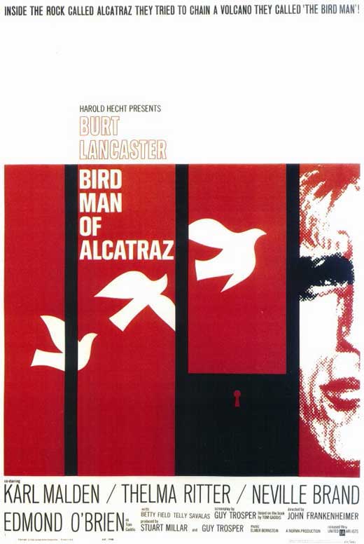


Paul Rand:
Alexander Girard:
Alvin Lustig
Alan Fletcher:
Alex Steinweiss:

The Eames:
Maira Kalman:
Steven Heller:
Wednesday, January 26, 2011
summerfest research
Project Brief:


The goal of this project is to develop a mark and identity system for the Summerfest Concerts, a professional chamber music ensemble.
1. What is the single purpose of your company?
Summerfest, Inc. aims to enrich the cultural life of Kansas City through musical performance in order to foster interaction between musicians and their audience.
2. Who is my target audience?
The greater Kansas City, with aims to expand their demographics.
3. What does the audience expect to get out of the Summerfest?
A great musical and cultural experience.
4. What are my companies core values?
A strong local presence, creative integrity, maintaining a tight following or community, and strengthening the culture of Kansas City through good music.
5. What are the long-term goals?
Broadening their audience with a larger, more diverse crowd
6. What can distinguish Summerfest from any competitors?
Emphasis on local audience concentration and community
7. Complete brand attributes chart.
- informal 1 [2] 3 4 5 formal
- intimate 1 2 3 4 [5] public
- intimate 1 2 3 4 [5] public
- classic 1 2 3 [4] 5 modern
- shiny 1 2 3 [4] 5 matte
- cool 1 2 3 [4] 5 formal
- child 1 2 [3] 4 5 adult
- expansive 1 2 3 [4] 5 focused
- feminine 1 2 [3] 4 5 masculine
- need 1 2 3 [4] 5 desire
- expensive 1 2 3 [4] 5 affordable
- loud 1 [2] 3 4 5 quiet
- sophisticated 1 [2] 3 4 5 naive
- organic 1 [2] 3 4 5 industrial
- urban [1] 2 3 4 5 rural
- edgy 1 [2] 3 4 5 reserved
- regional [1] 2 3 4 5 national/global
- sexy 1 2 3 4 [5] gender neutral
- smart 1 [2] 3 4 5 basic
8. Create Associated word list
spirit, unity, grounded, fun, creativity, variety, diversity, community, local, warm, welcome, modern, contemporary, comfort, enjoyment, open, relaxed, urban, specific, public
Successful Logos:
Subscribe to:
Posts (Atom)