What are the advantages of a multiple column grid?
- A multiple column grid forces order onto a layout and acts as an orientating device for placing information by importance. It allows for complex information to be well-guided and seamless for linear reading and understanding. It also allows for good experimentation.
How many characters is optimal for a line length? words per line?
- 40-50 characters is the optimal amount for a line length. There should be anywhere from 6-8 words per line.
Why is the baseline grid used in design?
- It allows the bottom of every line of text to be set in uniform increments, allowing all lines to line up across the columns and creating good visual rhythm. Helps the structure.
What is a typographic river?
- Gaps that appearing to run down a paragraph of text, due to a coincidental alignment of spaces. They can occur regardless of the spacing settings, but are most noticeable with wide inter-word spaces caused by full text justification or monospaced fonts.
From the readings what does clothesline or flow line mean?
- An imaginary line that aligns horizontally to text to allow for good readability and flow.
How can you incorporate white space into your designs?
- White or negative space can be incorporated into designs by grouping or breaking up text into sections. Also leaving margins blank and maintaining asymmetry in white space makes for an interesting composition. Adjusting justification/ragging, type size, and column size also helps.
What is type color/texture mean?
- Typographic color is determined by the typeface, weight, spacing, leading, line length and more. It can be used to create depth, contrast, and varying densities and values throughout the design.
What is x-height, how does it effect type color?
- X-height is the height from the baseline to usually the top of a lowercase letter in a typeface. It affects typographic color because it can give the copy varying values of color through its size differentiation.
In justification or H&J terms what do the numbers: minimum, optimum, maximum mean?
- Minimum refers to the least amount of words before and after a hyphen. Maximum refers to the space being manipulated so the right and left margins are straight. Optimum refers to fitting the most amount of words in a given space with consideration to page style.
What are some ways to indicate a new paragraph. Are there any rules?
- There are many ways. It can be done through use of rules, color fields, dropcaps, different font-styles like bold or italic, weight, leading, size, indentation, highlights, spacing, and more. The only rule I know of is to not indent the first paragraph. Other rules include: size of indent (use equal to leading or slightly larger, but always less than 1/2"), if indenting do not add a space between paragraphs,
What are some things to look out for when hyphenating text.
- Make sure there are no more than 2 consecutive hyphenated words. Avoid frequent hyphenating, and avoid hyphenating headings. Don't leave hyphenated widow (two letters before or after hyphenation). Don't hyphenate proper nouns or people's names. Callout's should have words like "the" or "and" down the next line and not by themselves
What is a literature?
- What? I guess any body of work that incorporates language to relay information, non-fiction or otherwise.
What does CMYK and RGB mean?
- CMYK is the acronym for Cyan-Magenta-Yellow-Black and is commonly used in the color printing process. RGB means Red-Green-Blue and is an additive color spectrum that reproduces vast arrays of color in a similar way CMYK does, but is predominately used in electronic color display.
What does hanging punctuation mean?
- Hanging punctuation is when the first quotation hangs outside the line of copy.
What is the difference between a foot mark and an apostrophe?
- A foot mark is a straight line used for measurement, while an apostrophe is a single quotation mark used to close a word
What is the difference between an inch mark and a quote mark (smart quote)?
- Quote marks indicate dialogue or speech, inch marks represent measurement.
What is a hyphen, en dash and em dashes, what are the differences and when are they used.
- Hyphens are used to break words and lines. En dashes are used between words indicating duration of time. Em dashes are used for sudden changes in thought. Should not have three hyphens in a row.
What are ligatures, why are they used, when are they not used, what are common ligatures
- Ligatures are single forms incorporating two or more letters, parts that touch or overlap for instance fi and fl. S A set of standard ligatures would be- fi fl ff ffl or ffi. There are also special ligatures in which an extended set of many letters are combined for visual effect. The designer may choose when to use ligatures. Serifs are the typefaces that usually have ligatures.

Me llamo Jon Duong. This is a blog for design school.
Monday, February 28, 2011
Sunday, February 27, 2011
Project Two Preliminaries: Open Letter to Design Students Everywhere
Article: Open Letter to Design Students Everywhere
Author: Jessica Helfand
Who is Jessica Helfand?
She is an author, columnist, and lecturer on graphic design. Helfand is also the partner of William Drenttel of Winterhouse Design Studios, Winterhouse Editions, and Winterhouse Institute in Falls Village, Connecticut. Winterhouse concentrates its work in editorial design and new design models for the changing media. She is also the founding writer for the Design Observer weblog and a critic in graphic design for Yale University.
Article Summary
Jessica wrote this article concerning students the design field. It covers many stages in a design student's life, from starting out in school to the first career interview, and offers helpful advice in every situation she describes. She answers some popular life questions that design students face throughout their career and provides tips to stimulating creativity and improving design method.
Important Points
- Put yourself out there in any way possible. Use the web, it is growing as a useful tool for such the occasion.
- Network. Meet people, listen to their advice, learn about the interviewers choices and how they choose.
- Be prepared. Arrange interviews and confirm beforehand, and afterwards send a thank-you note.
- Travel and explore. Get outside the comfort zone and keep a notebook handy. Record thoughts or drawings, use observations as the basis for inspiration.
- Simplify. Try not to get complicated, strive for emphasis on the important material and keep it clarified. Less is more.
- Be free to think. You can be structured, but don't let structure stop you from thinking, asking questions, exploring new ideas. Don't be afraid to start small, because big results can come out of it.
Sunday, February 20, 2011
Journal 4: Incomplete Manifesto for Growth
Mantra for the Week: Take Field Trips
The bandwidth of the world is greater than that of your TV set, or the Internet, or even a totally immersive, interactive, dynamically rendered, object-oriented, real-time, computer graphic–simulated environment.
- I really do need to step away from the computer. When designing, I often find myself grounded in searching for creativity through the single conduit that is my precious internet. What I need to do is step away, if only for a moment, to find inspiration on the outside.
Who is Bruce Mau?
- Simply, a designer. Specifically, a designer who is extremely concerned with the ever-changing design world, and has made efforts to help the transition.
What has he done?
- Aside from great designs, Mau has founded the Institute without Boundaries, a groundbreaking studio-based postgraduate program. This became the engine for Massive Change, an ambitious travelling exhibition, publication, and educational program series on the power and possibility of design.
Why is he interesting to us?
- His manifesto has reiterated so many little things that tend to be forgotten in the design process. From stepping away from the computer to forgetting about good and remembering growth.
Journal 3: TED Conference
Stefan Sagmeister:
After looking through the many forms of happiness that make up Stefan's life, he finds that most happiness stems from design-oriented subjects. He looks at it from two different standpoints, the consumer's and the designer's views. Aside from that, he also talks about abstraction to a degree, citing a Yves Kline painting, saying the theory was that if you abstract an image, you open as much room for the unrepresentable and, therefore are able to involve the viewer more. In viewing happiness, Sagmeister goes on to say that the visualization has become easy, even to the point where being authentic can be a difficulty. So the solution to this is to go in different directions, like playing on cynicism to evoke happiness through irony. The trick is to get people involved, allowing the public to express themselves. It is good to draw from personal experiences as well when designing, and work on things that matter to you.
J.J. Abrams:
Abrams begins his presentation through a nostalgic dissection of one of his role models, his grandfather. He talks about their fascination with the inner workings of basic machinery to trades like silk-screen and letterpress. The idea of deconstructing to understand an object is something that Abrams seems to have done his entire life to appreciate the beauty and science of designing. An important point he brings up about design is the idea of representation, to design with representation is to design with potential. The number of infinite possibilities is a catalyst for imagination. He also mentions the embrace of new technologies and techniques in the creative process, which are good to open up even more ways to design and create well.
Ultimately Abrams strategy lies in creating a good mystery box. To withhold information engages the viewer and leaves them wanting more. It is up to the designer to use this to full advantage and couple it with good design strategy when creating, no matter what resources are at hand.
Ken Robinson:
Ken Robinson begins his lecture with a look into the fascination with education. He feels that though we as a country are so well-invested in education that ultimately the results of it are unpredictable. Robinson states specifically that children have an amazing capacity for innovation and dedication, but to a degree the educational system seems to squander that. Children take chances, they don't prepare to do the wrong thing. Going through education seems to strengthen the fear of doing the wrong thing, therefore the chance at creativity is diminished. Robinson goes on to say that there is a hierarchy in school subjects, at the top math, then languages, then humanities, and at the bottom the arts. For public education, the peak of success seems to be producing men and women that are able to teach in universities, but Robinson affirms his belief that they should not be held on a higher level of human achievement, for they are human just like everyone else. Nowadays there seems to be an academic inflation anyways, where once a job that required a BA may now require a PhD, and that degrees in general seem to be losing their worth.
Because of the problems discussed by Robinson, intelligence should be understood as something quite diverse. People think visually, their minds are dynamic, and individually distinct. He states that the education system has mined the mind searching for commodity. So he feels that now the principles of public education need to be reassessed for a more stimulated creativity and to ultimately, educate the whole being.
How Good is Good?
While bad design can make the world a hard place to live in, good design for bad things is just as terrible. But bad design for good things can sometimes turn out good as well. So what makes good actually good? First the designer needs to assess all their values. Is doing good for one value good for the others?
Importantly, to design well means doing a myriad of things. It unifies, helps us remember, simplifies, makes people feel better, makes the world safer, rallies for causes, teaches, raises money, and makes people more tolerant.
Monday, February 7, 2011
Journal 2: Good Design
Dieter Rams: ten principles for good design
- Good design is innovative: innovative design always develops in tandem with innovative technology, and can never be an end in itself.
- Good design makes a product useful: emphasize the usefulness of a product whilst disregarding anything that could possibly detract from it.
- Good design is aesthetic: only well-executed objects can be beautiful.
- Good design makes a product understandable: the product's structure should talk and be self-explanatory.
- Good design is unobtrusive: design should be both neutral and restrained, to leave room for the user’s self-expression.
- Good design is honest: do not attempt to manipulate the viewer with promises that cannot be kept.
- Good design is long-lasting: avoid being fashionable, as a result the design will not be antiquated.
- Good design is thorough, down to the last detail: care and accuracy show respect towards the consumer.
- Good design is environmentally friendly: conserves resources and minimize physical and visual pollution throughout the lifecycle of the product.
- Good design is as little design as possible: concentrate on the essential aspects.
Don Norman: 3 ways good design makes you happy:
- Good design should instill happiness. Positive thinking creates focus. When one is happier they are more susceptible to thinking outside the box.
- The 3 Ways
- Visceral - Emotional association through colors, sounds, etc. You can choose different typefaces to evoke certain moods.
- Behavioral - Playing on the subconscious, the automatic. Good behavioral design makes the user feel in control. Design to signal certain actions or feelings.
- Reflective - Looking over actions, focusing on the superego. Appealing to ideal images.
the rules of good design, and audience personas
Important rules to live by (or design by):
- Have a concept: having clear message is crucial. Without it there's no life to the design.
- Use two typefaces families maximum: having too many typefaces can be distracting. It can also hurt the unity of the design
- If you can do it with less, then do it: Speak with simplicity. The message of the design comes through faster and if done effectively can be profound and moving.
Rules that need practice:
- Negative space is magical, create it--don't just fill it up: I tend to forget that negative space can be a useful tool and I'll try and think about it more actively.
- Be universal; remember, it's not about you: It's good to take pride in what you've designed. But as a result one can become attached to the design. Remember that the design is for the masses.
- Look to history, but don't repeat it: Great works of years past are just that, the past. It's fine to pay tribute through hints, but a new design shouldn't be a mastercopy.
Rules to ignore, or at least not be adamantly against:
- Symmetry is the ultimate evil: I don't believe that symmetry is wholly evil. Sure a design can be dynamic through asymmetrical orientation, but sometimes I prefer a purity and balance brought about by symmetry.
- Create images--don't scavenge: Sometimes a designer is not the best photographer. Manipulating the image may not always work. I believe that if you can get the image to work with your design, then use it.
- Type is only type when it's friendly: What if you want to use type as shapes alone? Thinking past legibility and focusing on the form of a letter can be interesting. Effective cropping, layering, etc. has aesthetically pleasing possibilities.
Audience Personas
persona 1: conflicted space
Jake is a 19 year old aspiring writer who is living on his own for the first time in Austin, TX. After graduating high school, Jake attended college for a semester before deciding it wasn't right for him. Jake spent a good part of his childhood traversing many states with his father, who was a traveling musician. Eventually, in his early teen years, his family settled in Wichita. Early on, Jake discovered his love for writing and experimented with various compositions on a regular basis. He soon realized, however, that there a number of greater career opportunities in larger communities such as Los Angeles or New York. With many aspirations taking up Jake's spare time, he enjoys a lifestyle that only requires basic essentials like cheap and easy meals, an extremely modest living arrangement, and clothing for function rather than style. Aside from writing, playing a game of pickup soccer, or having deep philosophical conversations, Jake has taken up various job opportunities in order to raise the proper funds to pursue his dreams.
persona 2: isolated combat
George is a 13 year old of the suburban lifestyle in Stevenson Ranch, California. Like many boys his age, George enjoys many activities. He plays football for his middle school and enjoys playing video games like Halo: Reach or Starcraft II when not studying or practicing. Appearance is not a huge issue for George, whose mother often buys him clothes from supporting his favorite sports teams or cartoons. His grandfather is a WWII veteran and his father is a policeman, and as a result George has become a recent war-buff. Some of his friends have recently gotten into the world of airsoft gunplay, which simulates firefights with plastic BBs in lieu of bullets. Though George can sometimes be temperamental and easily frustrated, he finds solace in the physical activities of football and airsoft. In addition, George loves comics and graphic novels after appreciating the artistry found in his expansive video game collection. He'll often doodle concept characters when sitting in class or riding the bus to his football games.
persona 3: celestial obscurity
Matthew is a 23 year old recent college graduate from Iowa City, Iowa. He comes from an agricultural family, and was always fascinated with seeming unnoticeable things outside the farmland. From the inner workings of clocks to the veins in leaves, Matthew had a large interest in the minute. An activity he always did throughout his childhood was to get large star maps and connect the stars like dots to create neat images and forms. Though he didn't ever play sports competitively, he often watches for his fascination of the tactics and strategy behind them, often looking for the logic and probability of many of the actions. After acquiring his degree in mechanical engineering, George is planning on backpacking through Europe for a time before he starts pursuing a career.
Tuesday, February 1, 2011


notable designers, illustrators, etc
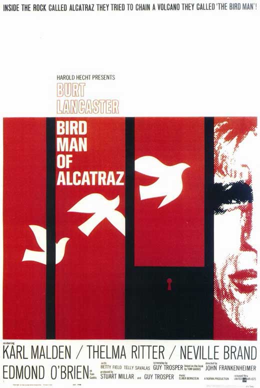
Saul Bass:


Paul Rand:
Alexander Girard:
Alvin Lustig
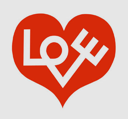
Alan Fletcher:
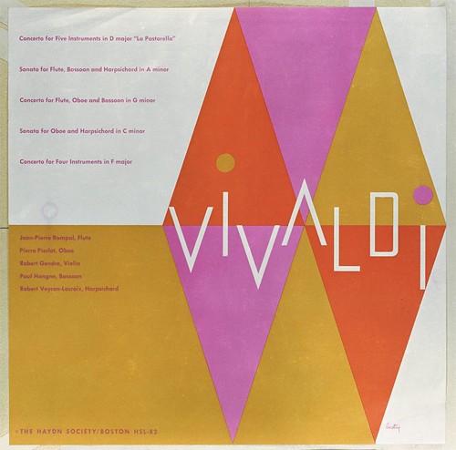
Alex Steinweiss:

The Eames:
Maira Kalman:
Steven Heller:
Subscribe to:
Posts (Atom)