Wednesday, December 15, 2010

illuminated letter final tidbits

Le Project Brief:

After understanding the history of the illuminated letter, I explored the contemporary counterpart. Based on the visual language of three artists of my choosing, I was instructed to create a series of illuminated letters based on their styles. Carefully studying what characterized the styles of my artists, I created three contemporary illuminated letters based on the initial of their last names. General parameters included careful emulation of artistic style through form and color. 

Keith Haring:

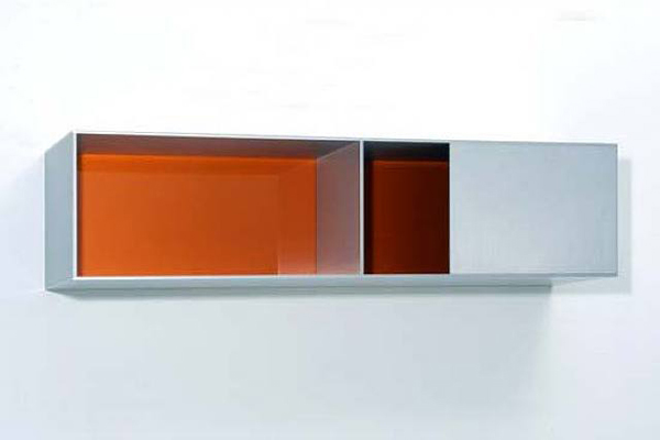
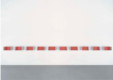
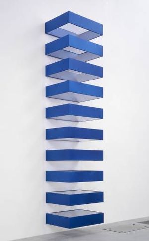
Donald Judd:

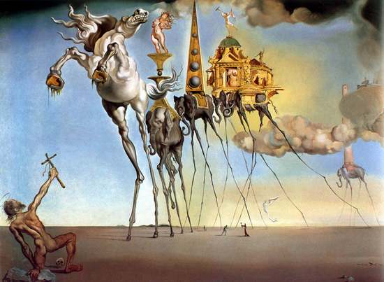
Salvador Dali:

Le Project Overview:

I enjoyed pretty much everything about this project. The timeline and workload was well paced and the parameters were fairly loose compared to the other projects. Because the artists of my choosing used different mediums, it was nice take a more hands-on approach to typography rather than spend the majority of the time using digital rendering of the works. If I had to do anything over again, I would like to like to explore more of my favorite artists, because although I really enjoy the works of the artist I eventually narrowed my project down to, it would be interesting to see how the styles are conveyed through letters.

Monday, November 29, 2010

All About the Artists: Illuminated Letter Supplements

Keith Haring:
- Fonts: Frutiger, Futura, Helvetica, Knockout, Syntax
- Words: playful, organic, contour, pattern, unity, controversy, motif, group


Salvador Dali:
- Fonts: Goudy, Palatino, Volta, New Baskerville, Bookman
- Words: fluid, sporadic, sexuality, melting, modeling, humanity, nonsensical, humorous, bold, elaborate


Donald Judd:
- Fonts: Akzidenz Grotesk, Gotham, Meta, Scala Sans, Trade Gothic
- Words: symmetry, seriality, geometry, tranquility, streamline, linear, balance, purity, industrial


Monday, November 15, 2010

project four tidbits

Illuminated Letter:
Illuminations

An illumination is an embellishment, or additional decoration that enhances the pages of a written, or manuscript page. The term, Illumination comes from the term Illuminate, or to fill with light. This effect is achieved with the application of gold leaf to the letters and images, which reflect light and appear to glow.

An illuminated letter was usually the first letter of a page or paragraph. It was always enlarged and in color with gold applied in areas, while the rest of the text remained black. The images used to enhance the letters include animals, plants, and mythological creatures. These images were modified to fit into or around the letter, or in some cases took on the shape of the letter itself.


Drop Cap:
The first letter of a paragraph that is enlarged to "drop" down two or more lines, as in the next paragraph. Drop caps are often seen at the beginning of novels, where the top of the first letter of the first word lines up with the top of the first sentence and drops down to the four or fifth sentence.


Artists I enjoy, worship, garner inspiration from, etc:

*Salvador Dali (surrealism) - A prominent Spanish surrealist painter. Dalí was a skilled draftsman, best known for the striking and bizarre images in his surrealist work. His painterly skills are often attributed to the influence of Renaissance masters. His best-known work, The Persistence of Memory, was completed in 1931. Dalí's expansive artistic repertoire includes film, sculpture, and photography, in collaboration with a range of artists in a variety of media.

*Donald Judd (minimalism) - An American minimalist artist (a term he stridently disavowed). In his work, Judd sought autonomy and clarity for the constructed object and the space created by it, ultimately achieving a rigorously democratic presentation without compositional hierarchy. It created an outpouring of seemingly effervescent works that defied the term "minimalism."

*Keith Haring (graffiti, street art) - An American street artist who used a unique style inspired by graffiti, cartoons, and comic strips, which he displayed in works drawn clandestinely at night on subway station walls around the city. He also created paintings, drawings, and prints in a graffiti style, filling the works from edge to edge using signs, abstract symbols, and human and animal figures writhing in a spaceless, airless design. In the 1980s he executed murals in New York and exhibited internationally, achieving great commercial success.


Honorable Mentions:

Storm Thorgerson (graphic design)

Adam Jones (video art)

Thomas Cole (romanticism)

Sunday, November 7, 2010

Wednesday, October 6, 2010

typeface film thoughts

so we watched "typeface" on monday. at the beginning, the film presented me with a lot of interesting little facts about the beauty of letterpress. i guess i never really thought about the historical significance and rich history until i learned that it dates back several hundred years and that many print shops could be found within a half-mile of each other in their prime time. as the film progressed, it took a sort of tragic note. after looking at the shots of the hamilton museum, it did not surprise me to learn that the process is actually dying with the growth of digital processes, and that overall demand for letterpress is just dropping. the film obviously advocates for the preservation of letterpress through the tone it takes in the latter half, which is fine, but i honestly do not believe that it will ever make a full revival. as tragic as that sounds, that's the reality of it. i think anyone that really loves letterpress will make sure it remains known, for the sake of themselves or for history.

Sunday, October 3, 2010

goudy old style

Goudy Old Style:
Through its many distinct features like rounded serifs and unique charm, one can carefully see all the intricate details of Goudy Old Style’s form. As all letters of a typeface should be considered a part of a whole group and not seen merely as individual forms, Goudy Old Style does well to stay highly formulated and consistent throughout the entire typeface. With little contrast between the thick and thin lines that make up this typeface, Goudy Old Style still somehow remains slender in overall form. Goudy Old Style is orchestrated so meticulously, it is virtually as if the font itself is held to such high standards that it must have a perfect presentation every time. The font has had the pleasure of gracing the covers of Harper’s Magazine, and it is proudly presented as text on Western Union and Heritage Bank’s logo. It has also been the typeface of choice for such esteemed universities as Emory and Kellogg School of Management. Its grace and balance has made it one of the most legible and readable typefaces in both print and digital applications.
In most cases, Goudy Old Style is seen in companies and organizations with a highly regarded image and reputation. It is of certainty that this font is dignified in its conception as being introduced into the Old Style font family in 1915. Even from the designer of the typeface alone as grounds, the font is held in high regard and with good reason. One of 122 typeface products of the esteemed Frederic W. Goudy, its precision takes on an especially traditional stance. Goudy is considered to be one of the greatest contributors of typography having studied it for many years. The better part of his consisted of publishing and designing typefaces such as Camelot Old Style and Copperplate Gothic. Goudy Old Style came to be after Frederic continuously examined the inner workings of a typeface and how to correctly formulate one. After much research and experimentation, Frederic Goudy had the formulations down to a science. Goudy studied masters of font creations such as the 15th century graphic artist, Albrecht Dürer, who meticulously formed his letters using graphs, lines and circles. The process of breaking down a letter’s form into a mix of handmade uncials and capitals gave way to a new style of writing. At the time, letters were being employed with more rounded curves to emulating handwriting due to the introduction of new materials like parchment and vellum that the letterforms were being placed upon.
The main characteristic that sets itself apart from the rest is the distinguished and famous diamond shape diacritic that rests above the letters, “j” and “i,” and also lies at the end of a sentence. Its charismatic diamonds are just one attribute that set it apart from many of the Old Style typefaces. Frederic Goudy once stated, “All writing or lettering is a form of drawing--Simple of course. The characters of our alphabet were originally pictures or symbols.” Typical of many Old Style fonts, Goudy has sturdy, scooped serifs. These serifs are also rounded and slopped. The stress is angled, and the heads of many of the lowercase letters are oblique. When comparing the stem each letter, design carries a unified theme through a distinct upwards curl. One example is the lowercase “t.” Unlike Egyptian or slab serif fonts, the filets and serifs of the letter are curved upward at an angle. The uppercase “w” deviates from other Old Style fonts as its form contains a crossbar rather than an apex. It resembles two “v’s” that have overlapped rather than connected.
Other characteristics of this typeface are the thin hairlines and stroke-to-height ratio. Examination of the uppercase “P” reveals that the bowl is left open and exposed therefore almost creating a counter. The typeface consists of a short beardline but it has a medium x-height, which can almost visually exaggerate the typeface’s ascenders, thus leaving less focus on its descenders. Because the typeface contains curved and wavy serifs, it leaves for an uneven looking baseline. It also leaves no terminals in the typeface. Despite these uneven looking characteristics that do reflect that handwriting style Old Style advocates, the arms and legs of Goudy Old Style do remain straight. Also, the ampersand, or “&” of this typeface is created with an open bowl rather than a closed one, a more common attribute seen in Old Style typefaces.
There are a number of variations to the Goudy Old Style font family worth noting. Frederic Goudy designed Goudy Cursive, a “loose italic” variation of Old Style in 1916. Morris Fuller Benton designed Goudy Bold in the same year. Frederic returned to the typeface in 1918 by designing Goudy Old Style italic. Goudy Title, a full size variation on Goudy’s small capitals from his Old Style and was designed again by Morris Fuller Benton in 1918, who also designed Goudy Bold Italic in the subsequent year. Goudy Catalog and Goudy Catalog Italic, medium weight companions to Old Style, were designed again by Morris Fuller Benton in 1919. In 1922, Goudy Handtooled Italic was born. Goudy Heavy Face Open and Goudy Heavy Face Condensed were designed by Sol Hess in 1926 and 1927 respectively. Once again, Morris Fuller Benton extended his series of variations with Goudy Extra Bold Italic in 1927. To appeal to children’s books, Goudy Old Style Infant was conceived but is rare to find in this day and age.
At a glance, one might believe that Goudy Old Style reflects the same philosophy of Albrecht Dürer’s geometry of lettering: rounded curves and less right angles for an easier flow of writing. But closer looks at the small characteristics reveal quite the contrary. Out of 122 typefaces Frederic Goudy created, this particular one carries his name. It was neither the first nor the last typeface created by Goudy. One theory may by that this typeface must have more of his personality implied than over any other one created by him. It is quite possible that he is most proud of this typeface, for it has gone on to define him, as well as Old Style, long after his time.

History

In 1915, World War I was under way, but the United States was not yet an allied power. The National Advisory Committee for Aeronautics, a predecessor of NASA, was founded. Pluto was photographed for the first time, but not yet classified as a planet. Babe Ruth hit his first home run in this year. The United States began to occupy Haiti in the summer. The first prototype tank was tested for the British Army in the early fall. The theory of general relativity was formulated. Ambrose Heal founded the Design and Industries Association in London. The Dada Movement began in Switzerland in response to the outbreak of World War I. Much of history was centered on the actions of the Allied and Central Powers during said war.


Frederic W. Goudy

Frederic W. Goudy was born in Bloomington, Illinois on March 8, 1865. A man of irrepressible energy and determination, he began working as a bookkeeper, where he taught himself printing and typography. Moving from job to job, until he finally set up a small print shop with a friend but sold his share of the business in 1896. Whilst looking for another job, Goudy designed his first set of capitals in the alphabet, which he named Camelot. This lettering was quickly bought by the ATC and Goudy began his freelance career as a lettering artist. He worked for numerous publishers and department stores while simultaneously teaching lettering at the Frank Holme School of Illustration.

In 1903 he started his second print shop, Village Press, with Will Ransom in Park Ridge, Illinois. The shop was moved to Boston, Massachusetts and later New York City, New York in 1908, where it burned down that same year. After losing the majority of his printing equipment to the fire, Goudy took the opportunity to concentrate his time entirely on type design. He designed his first type, 38E, for the Lanston Monotype Company in 1908, but it was later marketed as Goudy Light. Around this time, the private-press movement was at its height, and in 1911 Goudy was commissioned by the New York publisher Mitchell Kennerly to produce a typeface that he simply named Kennerly. This typeface was his first important book type and popular success.

Soon the American Type Founders Company began to garner interest in Goudy and commissioned him for a typeface. It was here that Goudy created the most widely used type he ever designed, Goudy Old Style. By 1920, Frederic Goudy was made art director for Lanston Monotype, a position he held for twenty years. In 1925 he moved to Marlborough, New York where he opened up a type foundry where he studied the skill of engraving his own matrices. In 1927 he was made vice president of the Continental Type Founders Association. From 1927 to 1929 he taught type at New York University.

Unfortunately in 1939 Goudy’s home and foundry burned down. After losing the majority of his work, Goudy resolved to dedicate the remainder of his life to teaching. In 1940 he began teaching calligraphy at the University of Syracuse.

Starting his type career at the age of 40, Goudy often considered himself a failure. However, over the next 36 years, starting almost from scratch at an age when most men are permanently set in their chosen vocations, he had produced 113 fonts of type, thereby creating more usable faces than many inventors of type and books. By the end of his life in 1947 Goudy had designed 122 typefaces and published 59 literary works. Notable typefaces designed by Frederic W. Goudy include: Camelot (1896), Devinne Roman (1898), Pabst Old Style (1902), Powell (1903), Copperplate Gothic (1905), Goudy Old Style (1915), Collier Old Style (1919), Marlborough (1925), Remington Typewriter (1927), Goudy San Serif (1929), Bertham (1936), Murchison (1938), and Goudy Thirty (1953, posthumous).


Bibliography
Robin Dodd. From Gutenberg to Opentype
Christopher Perfect, Jeremy Austen. The Complete Typographer
Alexander S. Lawson. Anatomy of a Typeface
http://www.britannica.com/EBchecked/topic/239950/Frederic-W-Goudy
http://en.wikipedia.org/wiki/Frederic_Goudy
http://www.pointlessart.com/education/loyalist/typetalk/goudy2/goudy.html

Thursday, September 30, 2010

Tuesday, September 28, 2010

typography one : project two, i

Goudy
- Serif
- Frederic Goudy
- 1915
- Old Style
- Family:
  • Old Style
  • Cursive
  • Bold
  • Old Style Italic
  • Title
  • Bold Italic
  • Catalog
  • Handtooled + Italic
  • Heavy Face Open
  • Heavy Face Condensed
  • Extra Bold + Italic
  • Old Style Infant


Font Classifications:

Old Style:
– based on handwriting
– contrast between thick and thin strokes is more pronounced
– slight diagonal stress
– shorter x-height
– scooped serifs, sturdy without being heavy

Bembo, Caslon, Garamond, Jenson, Palatino


Transitional:
– contrast between thick and thin strokes is more pronounced
– very slight diagonal stress
– bracketed serifs
– tall x-height

Baskerville, Caslon, Perpetua, Modern Times, Antiqua


Modern:
– extreme contrast between thick and thin strokes
– flat unbracketed serifs
– hairline serifs
– no horizontal stress
– mathematical construction /measurements
– no influence by handwriting

Bodoni, Bauer Bodoni, Walbaum, Portobello, Didot


Slab Serif:
– mono weight
– square ended serifs
– no stress
– bold machine like (industrial age/industrial revolution)
– uniform serifs
– bold display font (used at large sizes)
– rectangular
- geometric impact

Serifa, Rockwell, Memphis Clarendon, New Century Schoolbook, Egyptienne


Sans Serif:
- Geometric
- circular or geometric letters
- little variation in stroke thickness
- modern look and feel
Futura, ITC Avant Garde, Century Gothic, Gotham, Spartan
- Humanist
- oval shapes and variations in stroke thickness
- human appearance
- most calligraphic of the sans serifs
Calibri, Johnston, Lucida Grande, Segoe UI, Gill Sans
- Grotesque
- uniform
- upright character
- early san-serif
Grotesque, Akzidenz Grotesk, Franklin Gothic, Univers, Helvetica


Script:
- varied stroke based handwriting.
- based on 17th and 18th Century writing styles
- fluid and formal

Brush Script, Kaufmann, Mistral, Marigold STD, Monoline Script


Blackletter:

- use letterspacing for emphasis
- tall, narrow letters
- letters formed by sharp, straight, angular lines

Sütterlin, Fraktur, Textur, Rotunda, Cursiva


Grunge:
- dirty, irregular
- crooked
- influenced by punk, rock, heavy metal

Turbo Ripped, Dirty Ames, Sidewalk, Neoprint M319, Trashed


Monospaced:
- glyphs are the same width
- first used for typewriters
- often used to make ASCII art

Courier, Andale Mono, Vera Sans Mono, Lucinda Console, Prestige


Undeclared:
- mix of classifications
- unable to distinguish
- examples include flared serifs on sans serif structures

Optima, Fixedsys, Copperplate Gothic, Gotham, Cooper Black

Monday, September 6, 2010

typography one : project one, iii

adrian frutiger - a prominent swiss typeface designer of the twentieth century whose career and typeface development spans the hot metal, phototypesetting, and digital typesetting eras. he is best known for creating the typeface, Univers. as a child he experimented with scripts and stylized handwriting, in a reaction against the then required cursive writing in swiss schools. at sixteen he apprenticed printer otto schaerffli for four years before moving on to study under walter käch and alfred willimann in the kunstgewerbeschule (school of applied arts) in zürich, where he focused on calligraphic experimentation. after developing many typefaces for charles peignot of deberny & peignot, a french type foundry, frutiger released Univers in 1957 and received much acclaim. from the 1970s to 1990s, frutiger spent most of his career creating variations and adaptations of fonts like Univers or his self-titled Frutiger for numerous clients that include the charles de gaulle airport and the paris metro. most recently, the swiss watchmaking company named ventura commissioned frutiger to design a watch face for a series of limited edition wristwatches. in 2009 he was inducted into the European Design Hall of Fame. some notable typefaces of frutiger include: Egyptienne, Univers, Apollo, Serifa, OCR-B, Frutiger, Avenir, Herculanum, and Linotype Didot.

Univers is notable for having 44 faces, with 16 uniquely numbered weight, width, position combinations. 20 fonts have oblique positions. 8 fonts support Central European character set. 8 support Cyrillic character set. The Univers grid is classification system to eliminate naming and specifying confusion. The number used in a font is a concatenation of two numbers. The first set defines weight, while the second defines width and position. In the Linotype Univers font family, a 3-number system is used. First letter describes font weight, second letter describes font width, third letter describes position

Sunday, August 29, 2010

typography one : project one, ii

1. weight - the overall thickness of strokes in relation to their height. standard weights within a family often include light, medium (regular), bold, and black or heavy weights.

2. width - how wide the letterforms in a typeface are in relation to their height. a typeface in which the letterforms are narrower than regular is referred to as condensed or compressed; a face that is wider than regular is referred to as extended or expanded.

3. style - a broad term referring to several aspects of a typeface. first, style can be divided into serif or sans serif. second, style can be historically classified based on the visual idiosyncrasies related to its historical context. third, style refers to the specific form variations that a designer has imposed on the letters, like neutral or stylized.

4. the point system is used to measure type. one point equals 1/72 inch or .35 millimeters. twelve points equal one pica, the unit commonly used to measure column widths. type can also be measured inches, millimeters, or pixels. most software applications let the designer choose a preferred unit of measure; picas and points are a standard default.

5. point - measurement equivalent to 1/72 inch or .35 millimeters

6. pica - measurement equivalent to twelve points

7. 1 inch = 72 points

8. If a letter is set in 36 pts it is a 1/2 inch tall

9. 1 inch = 6 picas

10. 1 pica = 12 points

11. x-height - the height of lowercase letters in proportion to the ascenders and descenders.

12. cap height - the height of the capital letter.

13. leading - amount of vertical spacing between lines of type.

Tuesday, August 24, 2010

typography one : project one, i

1. grid - a series of regularly spaced horizontal and vertical lines used as a means of organization.

2. designers use a grid as a simple way of organizing large amounts of information. the grid can help a designer compare and contrast different forms of information without compromising the quality of each piece. it presents the project/projects in an easily read composition

3. a modular grid is a grid with four rows and four columns. when repeated these grids, or modules, are able to further subdivide or separate various projects.

4. margins - the negative space between the format edge and the page contents.
columns - vertical alignments of type that create horizontal divisions between margins.

grid modules - individual units of space separated by regular intervals that, when repeated across the page format, create columns and rows.

flowlines - alignments that break the space into horizontal bands

gutter - blank space between columns

5. hierarchy - a system of things ranked one above the other. designers can use hierarchy by manipulating the text in a way that is easily navigated by the viewer.

6. typographic color - altering the scale relationships of type. changing the weight, rhythm, value, texture of text achieves a visual darkness and even an illusion of spatial depth.

7. clear hierarchy can be achieved in many ways. It is important to maintain good organization. keeping similar material in close proximity, shifting or maintaining certain alignments, and size contrast (experimentation with stroke weight, distance, scale are all effective ways of achieving hierarchy.