Stefan Sagmeister:
After looking through the many forms of happiness that make up Stefan's life, he finds that most happiness stems from design-oriented subjects. He looks at it from two different standpoints, the consumer's and the designer's views. Aside from that, he also talks about abstraction to a degree, citing a Yves Kline painting, saying the theory was that if you abstract an image, you open as much room for the unrepresentable and, therefore are able to involve the viewer more. In viewing happiness, Sagmeister goes on to say that the visualization has become easy, even to the point where being authentic can be a difficulty. So the solution to this is to go in different directions, like playing on cynicism to evoke happiness through irony. The trick is to get people involved, allowing the public to express themselves. It is good to draw from personal experiences as well when designing, and work on things that matter to you.
J.J. Abrams:
Abrams begins his presentation through a nostalgic dissection of one of his role models, his grandfather. He talks about their fascination with the inner workings of basic machinery to trades like silk-screen and letterpress. The idea of deconstructing to understand an object is something that Abrams seems to have done his entire life to appreciate the beauty and science of designing. An important point he brings up about design is the idea of representation, to design with representation is to design with potential. The number of infinite possibilities is a catalyst for imagination. He also mentions the embrace of new technologies and techniques in the creative process, which are good to open up even more ways to design and create well.
Ultimately Abrams strategy lies in creating a good mystery box. To withhold information engages the viewer and leaves them wanting more. It is up to the designer to use this to full advantage and couple it with good design strategy when creating, no matter what resources are at hand.
Ken Robinson:
Ken Robinson begins his lecture with a look into the fascination with education. He feels that though we as a country are so well-invested in education that ultimately the results of it are unpredictable. Robinson states specifically that children have an amazing capacity for innovation and dedication, but to a degree the educational system seems to squander that. Children take chances, they don't prepare to do the wrong thing. Going through education seems to strengthen the fear of doing the wrong thing, therefore the chance at creativity is diminished. Robinson goes on to say that there is a hierarchy in school subjects, at the top math, then languages, then humanities, and at the bottom the arts. For public education, the peak of success seems to be producing men and women that are able to teach in universities, but Robinson affirms his belief that they should not be held on a higher level of human achievement, for they are human just like everyone else. Nowadays there seems to be an academic inflation anyways, where once a job that required a BA may now require a PhD, and that degrees in general seem to be losing their worth.
Because of the problems discussed by Robinson, intelligence should be understood as something quite diverse. People think visually, their minds are dynamic, and individually distinct. He states that the education system has mined the mind searching for commodity. So he feels that now the principles of public education need to be reassessed for a more stimulated creativity and to ultimately, educate the whole being.
How Good is Good?
While bad design can make the world a hard place to live in, good design for bad things is just as terrible. But bad design for good things can sometimes turn out good as well. So what makes good actually good? First the designer needs to assess all their values. Is doing good for one value good for the others?
Importantly, to design well means doing a myriad of things. It unifies, helps us remember, simplifies, makes people feel better, makes the world safer, rallies for causes, teaches, raises money, and makes people more tolerant.

Me llamo Jon Duong. This is a blog for design school.
Sunday, February 20, 2011

Monday, February 7, 2011
Journal 2: Good Design
Dieter Rams: ten principles for good design
- Good design is innovative: innovative design always develops in tandem with innovative technology, and can never be an end in itself.
- Good design makes a product useful: emphasize the usefulness of a product whilst disregarding anything that could possibly detract from it.
- Good design is aesthetic: only well-executed objects can be beautiful.
- Good design makes a product understandable: the product's structure should talk and be self-explanatory.
- Good design is unobtrusive: design should be both neutral and restrained, to leave room for the user’s self-expression.
- Good design is honest: do not attempt to manipulate the viewer with promises that cannot be kept.
- Good design is long-lasting: avoid being fashionable, as a result the design will not be antiquated.
- Good design is thorough, down to the last detail: care and accuracy show respect towards the consumer.
- Good design is environmentally friendly: conserves resources and minimize physical and visual pollution throughout the lifecycle of the product.
- Good design is as little design as possible: concentrate on the essential aspects.
Don Norman: 3 ways good design makes you happy:
- Good design should instill happiness. Positive thinking creates focus. When one is happier they are more susceptible to thinking outside the box.
- The 3 Ways
- Good design is innovative: innovative design always develops in tandem with innovative technology, and can never be an end in itself.
- Good design makes a product useful: emphasize the usefulness of a product whilst disregarding anything that could possibly detract from it.
- Good design is aesthetic: only well-executed objects can be beautiful.
- Good design makes a product understandable: the product's structure should talk and be self-explanatory.
- Good design is unobtrusive: design should be both neutral and restrained, to leave room for the user’s self-expression.
- Good design is honest: do not attempt to manipulate the viewer with promises that cannot be kept.
- Good design is long-lasting: avoid being fashionable, as a result the design will not be antiquated.
- Good design is thorough, down to the last detail: care and accuracy show respect towards the consumer.
- Good design is environmentally friendly: conserves resources and minimize physical and visual pollution throughout the lifecycle of the product.
- Good design is as little design as possible: concentrate on the essential aspects.
Don Norman: 3 ways good design makes you happy:
- Good design should instill happiness. Positive thinking creates focus. When one is happier they are more susceptible to thinking outside the box.
- The 3 Ways
- Visceral - Emotional association through colors, sounds, etc. You can choose different typefaces to evoke certain moods.
- Behavioral - Playing on the subconscious, the automatic. Good behavioral design makes the user feel in control. Design to signal certain actions or feelings.
- Reflective - Looking over actions, focusing on the superego. Appealing to ideal images.
the rules of good design, and audience personas
Important rules to live by (or design by):
- Have a concept: having clear message is crucial. Without it there's no life to the design.
- Use two typefaces families maximum: having too many typefaces can be distracting. It can also hurt the unity of the design
- If you can do it with less, then do it: Speak with simplicity. The message of the design comes through faster and if done effectively can be profound and moving.
Rules that need practice:
- Negative space is magical, create it--don't just fill it up: I tend to forget that negative space can be a useful tool and I'll try and think about it more actively.
- Be universal; remember, it's not about you: It's good to take pride in what you've designed. But as a result one can become attached to the design. Remember that the design is for the masses.
- Look to history, but don't repeat it: Great works of years past are just that, the past. It's fine to pay tribute through hints, but a new design shouldn't be a mastercopy.
Rules to ignore, or at least not be adamantly against:
- Symmetry is the ultimate evil: I don't believe that symmetry is wholly evil. Sure a design can be dynamic through asymmetrical orientation, but sometimes I prefer a purity and balance brought about by symmetry.
- Create images--don't scavenge: Sometimes a designer is not the best photographer. Manipulating the image may not always work. I believe that if you can get the image to work with your design, then use it.
- Type is only type when it's friendly: What if you want to use type as shapes alone? Thinking past legibility and focusing on the form of a letter can be interesting. Effective cropping, layering, etc. has aesthetically pleasing possibilities.
Audience Personas
persona 1: conflicted space
Jake is a 19 year old aspiring writer who is living on his own for the first time in Austin, TX. After graduating high school, Jake attended college for a semester before deciding it wasn't right for him. Jake spent a good part of his childhood traversing many states with his father, who was a traveling musician. Eventually, in his early teen years, his family settled in Wichita. Early on, Jake discovered his love for writing and experimented with various compositions on a regular basis. He soon realized, however, that there a number of greater career opportunities in larger communities such as Los Angeles or New York. With many aspirations taking up Jake's spare time, he enjoys a lifestyle that only requires basic essentials like cheap and easy meals, an extremely modest living arrangement, and clothing for function rather than style. Aside from writing, playing a game of pickup soccer, or having deep philosophical conversations, Jake has taken up various job opportunities in order to raise the proper funds to pursue his dreams.
persona 2: isolated combat
George is a 13 year old of the suburban lifestyle in Stevenson Ranch, California. Like many boys his age, George enjoys many activities. He plays football for his middle school and enjoys playing video games like Halo: Reach or Starcraft II when not studying or practicing. Appearance is not a huge issue for George, whose mother often buys him clothes from supporting his favorite sports teams or cartoons. His grandfather is a WWII veteran and his father is a policeman, and as a result George has become a recent war-buff. Some of his friends have recently gotten into the world of airsoft gunplay, which simulates firefights with plastic BBs in lieu of bullets. Though George can sometimes be temperamental and easily frustrated, he finds solace in the physical activities of football and airsoft. In addition, George loves comics and graphic novels after appreciating the artistry found in his expansive video game collection. He'll often doodle concept characters when sitting in class or riding the bus to his football games.
persona 3: celestial obscurity
Matthew is a 23 year old recent college graduate from Iowa City, Iowa. He comes from an agricultural family, and was always fascinated with seeming unnoticeable things outside the farmland. From the inner workings of clocks to the veins in leaves, Matthew had a large interest in the minute. An activity he always did throughout his childhood was to get large star maps and connect the stars like dots to create neat images and forms. Though he didn't ever play sports competitively, he often watches for his fascination of the tactics and strategy behind them, often looking for the logic and probability of many of the actions. After acquiring his degree in mechanical engineering, George is planning on backpacking through Europe for a time before he starts pursuing a career.
- Have a concept: having clear message is crucial. Without it there's no life to the design.
- Use two typefaces families maximum: having too many typefaces can be distracting. It can also hurt the unity of the design
- If you can do it with less, then do it: Speak with simplicity. The message of the design comes through faster and if done effectively can be profound and moving.
Rules that need practice:
- Negative space is magical, create it--don't just fill it up: I tend to forget that negative space can be a useful tool and I'll try and think about it more actively.
- Be universal; remember, it's not about you: It's good to take pride in what you've designed. But as a result one can become attached to the design. Remember that the design is for the masses.
- Look to history, but don't repeat it: Great works of years past are just that, the past. It's fine to pay tribute through hints, but a new design shouldn't be a mastercopy.
Rules to ignore, or at least not be adamantly against:
- Symmetry is the ultimate evil: I don't believe that symmetry is wholly evil. Sure a design can be dynamic through asymmetrical orientation, but sometimes I prefer a purity and balance brought about by symmetry.
- Create images--don't scavenge: Sometimes a designer is not the best photographer. Manipulating the image may not always work. I believe that if you can get the image to work with your design, then use it.
- Type is only type when it's friendly: What if you want to use type as shapes alone? Thinking past legibility and focusing on the form of a letter can be interesting. Effective cropping, layering, etc. has aesthetically pleasing possibilities.
Audience Personas
persona 1: conflicted space
Jake is a 19 year old aspiring writer who is living on his own for the first time in Austin, TX. After graduating high school, Jake attended college for a semester before deciding it wasn't right for him. Jake spent a good part of his childhood traversing many states with his father, who was a traveling musician. Eventually, in his early teen years, his family settled in Wichita. Early on, Jake discovered his love for writing and experimented with various compositions on a regular basis. He soon realized, however, that there a number of greater career opportunities in larger communities such as Los Angeles or New York. With many aspirations taking up Jake's spare time, he enjoys a lifestyle that only requires basic essentials like cheap and easy meals, an extremely modest living arrangement, and clothing for function rather than style. Aside from writing, playing a game of pickup soccer, or having deep philosophical conversations, Jake has taken up various job opportunities in order to raise the proper funds to pursue his dreams.
persona 2: isolated combat
George is a 13 year old of the suburban lifestyle in Stevenson Ranch, California. Like many boys his age, George enjoys many activities. He plays football for his middle school and enjoys playing video games like Halo: Reach or Starcraft II when not studying or practicing. Appearance is not a huge issue for George, whose mother often buys him clothes from supporting his favorite sports teams or cartoons. His grandfather is a WWII veteran and his father is a policeman, and as a result George has become a recent war-buff. Some of his friends have recently gotten into the world of airsoft gunplay, which simulates firefights with plastic BBs in lieu of bullets. Though George can sometimes be temperamental and easily frustrated, he finds solace in the physical activities of football and airsoft. In addition, George loves comics and graphic novels after appreciating the artistry found in his expansive video game collection. He'll often doodle concept characters when sitting in class or riding the bus to his football games.
persona 3: celestial obscurity
Matthew is a 23 year old recent college graduate from Iowa City, Iowa. He comes from an agricultural family, and was always fascinated with seeming unnoticeable things outside the farmland. From the inner workings of clocks to the veins in leaves, Matthew had a large interest in the minute. An activity he always did throughout his childhood was to get large star maps and connect the stars like dots to create neat images and forms. Though he didn't ever play sports competitively, he often watches for his fascination of the tactics and strategy behind them, often looking for the logic and probability of many of the actions. After acquiring his degree in mechanical engineering, George is planning on backpacking through Europe for a time before he starts pursuing a career.
Tuesday, February 1, 2011


notable designers, illustrators, etc
Saul Bass:


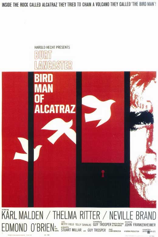
Paul Rand:

Alexander Girard:

Alvin Lustig
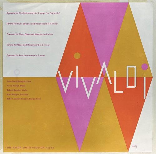
Alan Fletcher:

Alex Steinweiss:

The Eames:

Maira Kalman:

Steven Heller:

Wednesday, January 26, 2011
summerfest research
Project Brief:


The goal of this project is to develop a mark and identity system for the Summerfest Concerts, a professional chamber music ensemble.
1. What is the single purpose of your company?
Summerfest, Inc. aims to enrich the cultural life of Kansas City through musical performance in order to foster interaction between musicians and their audience.
2. Who is my target audience?
The greater Kansas City, with aims to expand their demographics.
3. What does the audience expect to get out of the Summerfest?
A great musical and cultural experience.
4. What are my companies core values?
A strong local presence, creative integrity, maintaining a tight following or community, and strengthening the culture of Kansas City through good music.
5. What are the long-term goals?
Broadening their audience with a larger, more diverse crowd
6. What can distinguish Summerfest from any competitors?
Emphasis on local audience concentration and community
7. Complete brand attributes chart.
- informal 1 [2] 3 4 5 formal
- intimate 1 2 3 4 [5] public
- intimate 1 2 3 4 [5] public
- classic 1 2 3 [4] 5 modern
- shiny 1 2 3 [4] 5 matte
- cool 1 2 3 [4] 5 formal
- child 1 2 [3] 4 5 adult
- expansive 1 2 3 [4] 5 focused
- feminine 1 2 [3] 4 5 masculine
- need 1 2 3 [4] 5 desire
- expensive 1 2 3 [4] 5 affordable
- loud 1 [2] 3 4 5 quiet
- sophisticated 1 [2] 3 4 5 naive
- organic 1 [2] 3 4 5 industrial
- urban [1] 2 3 4 5 rural
- edgy 1 [2] 3 4 5 reserved
- regional [1] 2 3 4 5 national/global
- sexy 1 2 3 4 [5] gender neutral
- smart 1 [2] 3 4 5 basic
8. Create Associated word list
spirit, unity, grounded, fun, creativity, variety, diversity, community, local, warm, welcome, modern, contemporary, comfort, enjoyment, open, relaxed, urban, specific, public
Successful Logos:








Monday, January 24, 2011
sign, index, and symbol
Sign: any object, action, event, pattern, etc., that conveys a meaning.

Index - something used or serving to point out; a sign or token.

Symbol - something used for or regarded as representing something else; a material object representing something, often something immaterial; emblem, token, or sign.


- Verbal signs: When a woman says, "I don't care" to any proposition that you make, they actually do care.
- Visual signs: A crossed out cigarette is a universal indicator for prohibited smoking

Index - something used or serving to point out; a sign or token.
- Verbal index: Pronunciations of certain words can indicate a particular geographic location or group
- Visual index: A sneering facial expression shows feelings of disgust or disagreement

Symbol - something used for or regarded as representing something else; a material object representing something, often something immaterial; emblem, token, or sign.
- Verbal symbol: Sarcasm, given a particular inflection of the voice, clues to an ironic context of the statement said.
- Visual Symbol: the symbol of Mars, denotes a male human being
What makes a successful bookjacket?

This is an unsuccessful jacket in my humble and honest opinion. While the image of the soccer ball with flags is an interesting concept that reflects the universal appeal of the sport, the size comparisons of each body of type makes the hierarchy weak and the overall design unappealing.

Minimalism at its finest. I find this to be a successful cover because it draws focus to the iconic single light in an interrogation scene. What is also quite nice is the use of typographic color. The title is white, and with its given proximity to the lightbulb can allude to the reaction of light, making the title an object in the scene. The authors name reflects the same theory, as it is further from the bulb and darker than the title. With this execution the design is clear, concise, unified and well executed.

Simplistic and successful type-based solutions tend to be few and far between. This cover is successful to me because of the cleverness of the upside-down orientation of the title. It plays on topic by manipulating the physics of readability. Not only that, the sizing of the type makes the hierarchy clear and sound.
Subscribe to:
Posts (Atom)